
The most exciting aspect of graphic design is the continuous change, evolution and over time, with technological developments, methodologies, approaches and tools for designers have changed and new possibilities become available. The future of design will be more innovative and dynamic than ever before.
A major trend in recent years is the use of augmented reality in design. AR makes it possible to develop interactive experiences that integrate digital components with the real world. It opens up new opportunities for brands to connect creatively with their target audience.
Motion graphics are another graphic design trend for 2024. As video becomes popular as content, designers are using graphics, animations more often, adding elements to static pages, attracting more attention. Below, let's break down the top web design trends in 2025 and 2024 that businesses, brands and everyone who is looking to attract new customers and retain old ones.
Technological advances in graphic design
Advances in technology have caused a revolution for graphic design at any IT conference in 2024. With the introduction of modern software, developers can make amazing effects and animations that were previously impossible. The tools at this point help to accomplish goals faster and more efficiently, which gives an increase in the quality of any project in a short amount of time.Cloud computing is one of the achievements that allows designers to access projects from any location in the world as long as the internet is available. This approach makes collaboration easier and more efficient. A team can be formed from different geographies to run a single project, even with different time zones.
The use of virtual reality is another technology used in design. With it comes exciting experiences that give projects life and make them unimaginable. Technology helps design a service, a product, an experience and refers to the visual, functional part, providing endless opportunities for creativity, integrating innovation.
The designer is a crucial component in a world that is rapidly changing and evolving, and visual communication is becoming a mandatory component of every business and brand. In a time of digital technology, such people must keep up with progress by developing visually appealing content that can convey the right message to end users. Especially if you are developing projects for crypto investment in 2024. As a result, a graphic designer must know the implications of a particular project for a particular medium. For example, designers in print media are fundamentally different from those who work with web platforms and social media.
Additionally, he needs to understand the target audience and adapt the designs to it. This will make it possible to evoke the right emotions in users.
Changes in consumer preference
Minimalism
Minimalism is a style that uses simple elements and a few colors to create clear and attractive graphics. It is used in web design trends 2024 and in areas such as logo trends, infographics, and business cards.
The style focuses on basic components to create a strong visual impact. Using only basic shapes and limited color schemes, minimalist designers create simple and memorable work.
Benefits of minimalism in graphic design:
- Makes the complex more understandable. When receiving large amounts of data, our brains become overloaded. By reducing the amount of information on a page, designers make it more accessible and understandable.
- Creates an atmosphere of order and calm. A clean and spacious design is a breath of fresh air in a world of information overload.
- Focuses the viewer's attention on what's important. The limited number of elements simplifies and clarifies the message inherent in the design.
- Blends with traditional and modern aesthetics. Minimalism is used in trends such as cyberpunk as well as art deco.
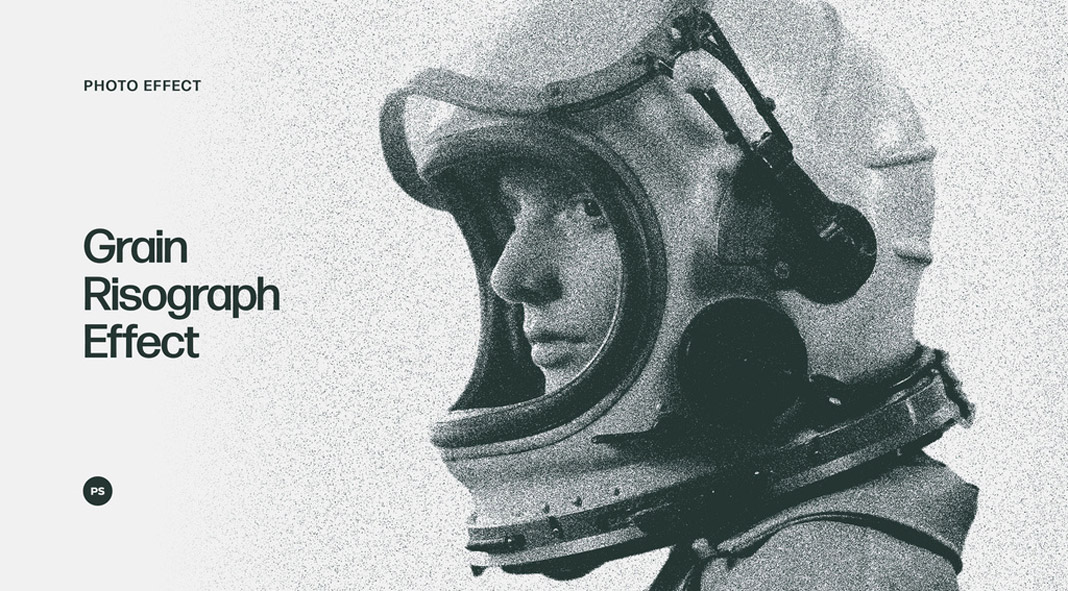
Grain Risograph effect
Grainy and noisy textures set new trends in graphic design in 2024 by giving works a realistic and vintage look. They are used with effects such as halftone dots and overlays.
Grain risograph effect by Pixelbuddha. Source.
With the right approach, such textures help create a cohesive and attractive style. However, they should be used with care, as too much can easily become excessive.
Grainy textures mimic the grits found on analog media. This approach evokes nostalgia and softens the edges. Applications:
- Vintage or retro designs
- Imitation of old printing methods
- Film photography
- Digital art and illustration
- 3D renderings
- Simulating natural environments
AI design
The ability to generate unique images using AI is attracting the attention of not only experienced designers but also beginners. You don't need to use top top programming languages. This is increasing the number of AI mentions on the Internet, which is setting new trends for graphic and UI design trends in 2024.
AI generates design elements, layouts, and volume designs based on a set of input parameters. Designers use AI tools to quickly find the right options to save time and effort.
The most popular AI design generators are:
- Midjourney
- Canva AI
- DALL-E 2.

The advantages of AI in Graphic Design. Source.
- Interdisciplinary collaboration. AI facilitates collaboration between designers and developers, allowing design concepts to be aligned with technical capabilities.
- Personalization. AI customizes design for individual users, increasing user engagement.
- Increased creativity. AI-generated suggestions stimulate creative thinking and inspire new approaches to design.
3D characters
Our usual and familiar world will soon be replaced by virtual reality. People are already used to seeing 3D images on screens, they are becoming more and more real. For this reason, working with characters in design is gaining popularity. A similar effect can accompany the target audience throughout the project, regardless of the software - site or app.
You can also add a combination of 3D and 2D elements. Such a combination immediately catches the eye and it looks beautiful, adding depth.

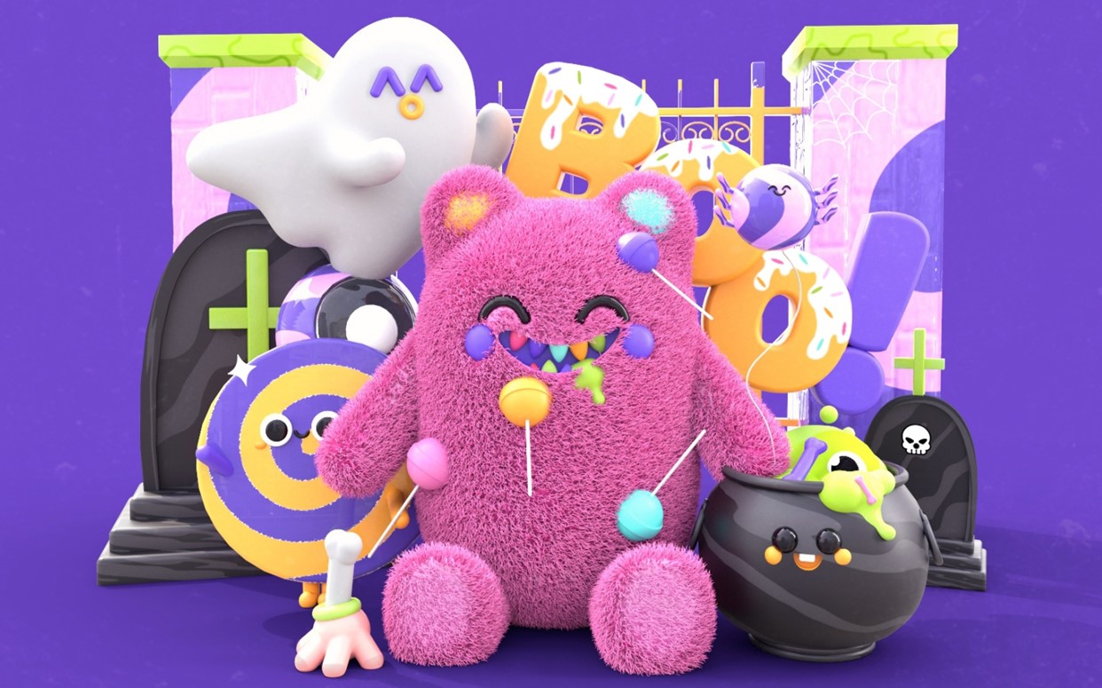
Candy colors
Applying sweet colors in the color palette allows you to create a project that looks like a magical land, which distances the audience from the real world. This trend helps to create a positive, more positive atmosphere, appealing to the inner child of the target audience.
Holographic design
The use of holographic effects is becoming increasingly popular. For example, this approach is used for concerts with artists who have already passed away. A similar tool is also used in graphic design, because modern users are fond of the transparent visual effect and neon colors.

Hand-drawn illustrations
Hand-drawn images allow you to make the design authentic, because such design is like a designer's signature, which helps to make the application, website, other product more human. The approach evokes more emotions and pleasant impressions than stock images.

It should be mentioned that the light color in the design helps to highlight the image, creating contrast. This tool is useful when working with visual content on crypto conferences in 2024.
Muted colors of nature
Pandemic times have led people to be more concerned about their own health and nature. As a result, more attention is focused on the environment and clean products. This trend has also affected the colors in graphic design. In 2024, the use of neutral colors, a muted palette that natural objects (earth, sea, foliage, etc.) have gained popularity.
Large and bold typeface
Typography is a big part of the design. Every year it gets bolder, bigger. It is an element of the style of maximalism, which was popular in 2022. Trends in graphic design in 2024 may apply bold and large fonts, which will attract the attention of the audience or to build a hierarchy among the elements of the interface. Many cryptocurrency exchange development companies around the world are using the trend to promote their own branding in web products and applications.Nostalgia
Instead of a futuristic style in 2024, a return to the 90s, 80s can win the market. This trend allows for a soothing atmosphere that suits many users in a modern and fast-paced world with lots of technology.
When choosing this graphic design, it is important to understand the end result and what needs to be achieved. For example, for new crypto projects, this approach may not work.
Anti-design
A trend that shows a movement against pop culture and popular trends, among which you can find minimalism or flat design, bright colors. The main parameters are the use of asymmetric shapes, rigid typography and a dark color palette.
Twisted fonts
Here it includes curved letters, unusual variants of fonts with the use of serifs, manuscript, etc. Such a trend of non-standard typography uses different deviations from the norm, for example, anti-design.

The example of the photo was a great way to get people's attention, making them read what the author had wanted to convey.
Geometric shapes
This kind of design is characterized by simplicity and minimalism, that's why people like it at any time and it is chosen for logo design trends in 2024, design of posts in social networks, etc. Despite the simplicity and purity of style with geometric shapes can bring the whole design to life. The main thing is to choose the right color scheme.

Glass and crystals
Instead of flat design, glitter and shimmering effects will be preferred in 2024. This type of content gives extra charm and glamour. The trend is not new, but it will continue over the next few years. This approach never gets old.
It's good to watch the latest trends and use them when working on new projects that it doesn't always help to achieve the right result. Sooner or later, the design will become obsolete or simply be familiar to the audience. As a result, there is a balance between creativity and convention and designers in 2024 have to find a middle ground. It will create a "timeless work" in graphic design. For example, designs from Apple, Spotify or Mastercard remain unique and enduring, even though they have undergone several changes over the course of their existence.
Over the next 5-10 years, graphic design will gain more experience and will be significantly more interactive. These factors are related to advances in technology and capabilities. Designers themselves will work on projects that work directly with the CA. VR and AR tools will become more accessible, which serves as a reason to adapt any design, creating new and unique experiences. Automation, the integration of MO and AI trends will also have a strong impact with changing the way designers work to discover new possibilities.


