
It is difficult to change a first impression, and 90% of people pay attention to web design the first time they come into contact with a website, app or other product that a business provides. With a great design, the number of sales will improve. For 2025, it will be very important to incorporate design into your marketing strategy and carefully craft it. However, you have to understand the current trends and tendencies of this direction and how to utilize them to make the website or app fresh, interesting and attractive.
As a separate field, web design is regularly evolving, with new trends and improvements being introduced every year. There are technological innovations, changes in the taste of users themselves, dynamic nature and so on. Nowadays, ideas are becoming relevant that a couple of years ago no one used and vice versa.
Let's analyze the main trends of web design for 2025, which will not remain indifferent, even the most sophisticated users.
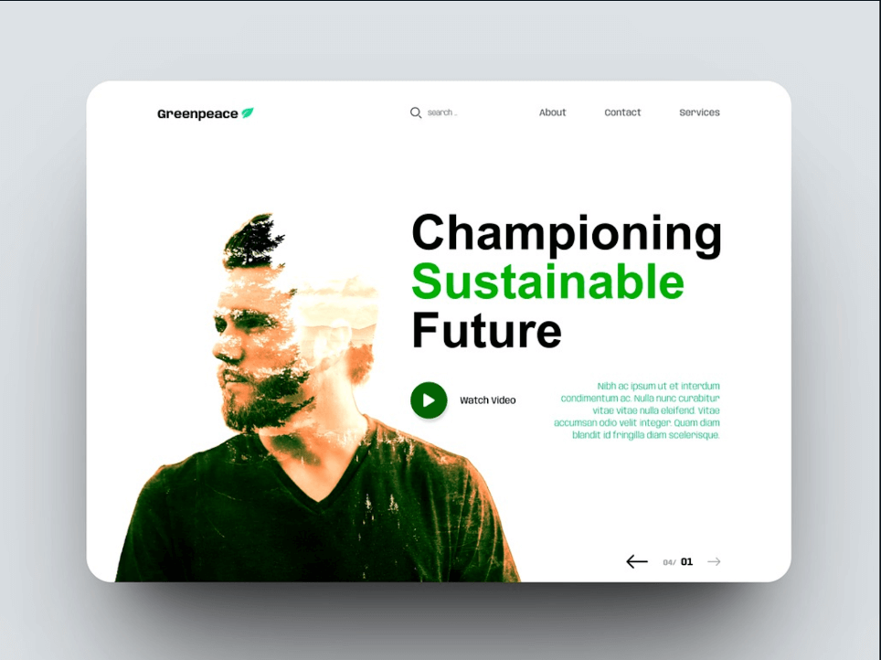
Custom illustrations
It is possible to make a website or brand more lively with the help of illustrations. In the modern design of 2025, traditional art formats will prevail rather than computer-generated images. And that's where custom illustrations come in. Not just providing additional uniqueness, but also helping to create a recognizable product or company.Well-known illustrator Alice Lee's work is becoming increasingly popular. She has created a number of images for brands including Macy's and The Washington Post. The headlines on her website are changing with the cursor movement, which has an interesting effect, holding the users' attention.
Technology is evolving and the possibilities of image encoding are increasing, which is beyond the scope of 2D design. In the described trend, you can apply slow color changes with gradients, darkening or digital cut styles, as if the layer was cut on a piece of paper.
Full-page headlines
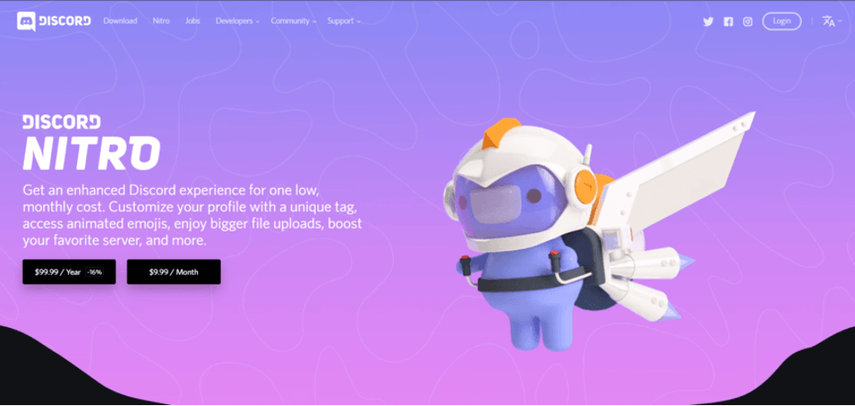
In modern web design, full-page headers can be used. Variations of them can be different, but a popular customization includes adding text or an active button with a beautiful picture. The information is better placed on the left side of the page, where people's attention is most focused.Discord website showed an interesting, slightly fanciful picture in the right part of the header, but in the left part it placed important information and a couple of active buttons for paying services. Icons are clearly visible, convenient and show users exactly what they need. By moving down on the site, there are other, sequential pages. They are readable, simple, but with the preservation of fun design elements.
White space
Minimalism is something that doesn't get old over the years, and modern web design utilizes the trend of purposeful white space, similar to the way magazines do.The approach will bring users to the pages of the site, quickly moving from one element to another. It forms a visual structure, where each part will not distract from the main process of working with the site. While viewing such pages, the eyes do not get tired. Being aware of the rules of white space helps to improve the user experience. Let's consider as an example.
The playful cursors
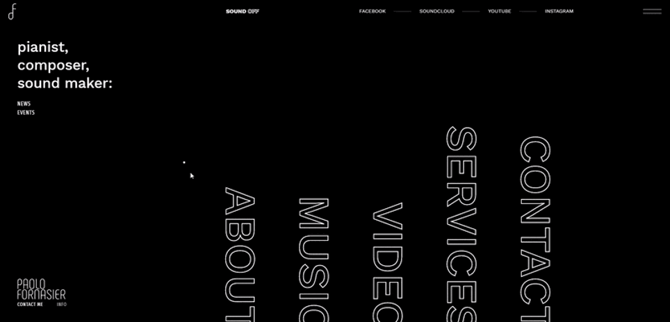
Nowadays, you can already notice how web design has started to use unusual cursors that give a new users' experience. It is about implementing game cursors for websites, changing their sizes or shapes, animation and other actions. Everything will be easy to find and implement in 2025, and site users can not only interact with the product, but also have a great time using a unique element.Paolo Fornacira presented a great cursor option on his website. It shows different photos with great animation and piano tone while scrolling.
You don't have to make a complicated cursor like in the example above, but adding unique details will definitely add a twist to the site.
Increased attention to UX/UI
Since 2020, the main trend of web design is the focus on people, and in 2025, the emphasis will be even more in this direction. It is about the following parameters:- Fast performance and page loading.
- Proper SEO.
- Multimedia elements.
The designers have to utilize not only functionality or creativity, but combine the two concepts to get a quality UX as a result. It is possible to lean on pure design with elements of uniqueness and creativity with such kind of work. The UX, the user interface all of this should become intuitive for people. For this purpose, the following will work:
- Photo captions, image captions.
- Video transcriptions.
- Absence of distracting details.
- User-friendly interface.
- Balanced design.
Every website visitor should be able to recognize and read content effortlessly and get an easy-to-use interface. Consideration of mobile surfing on the web is equally important. By 2025, even more people will use tablets and phones to work with websites or applications. More than 50% of traffic comes from mobile devices. The number of users is only increasing every year.
To get a successful, modern design, all parts of the website must be perfect on PCs and on mobile technology. For this purpose, adaptive animation, videography is suitable.
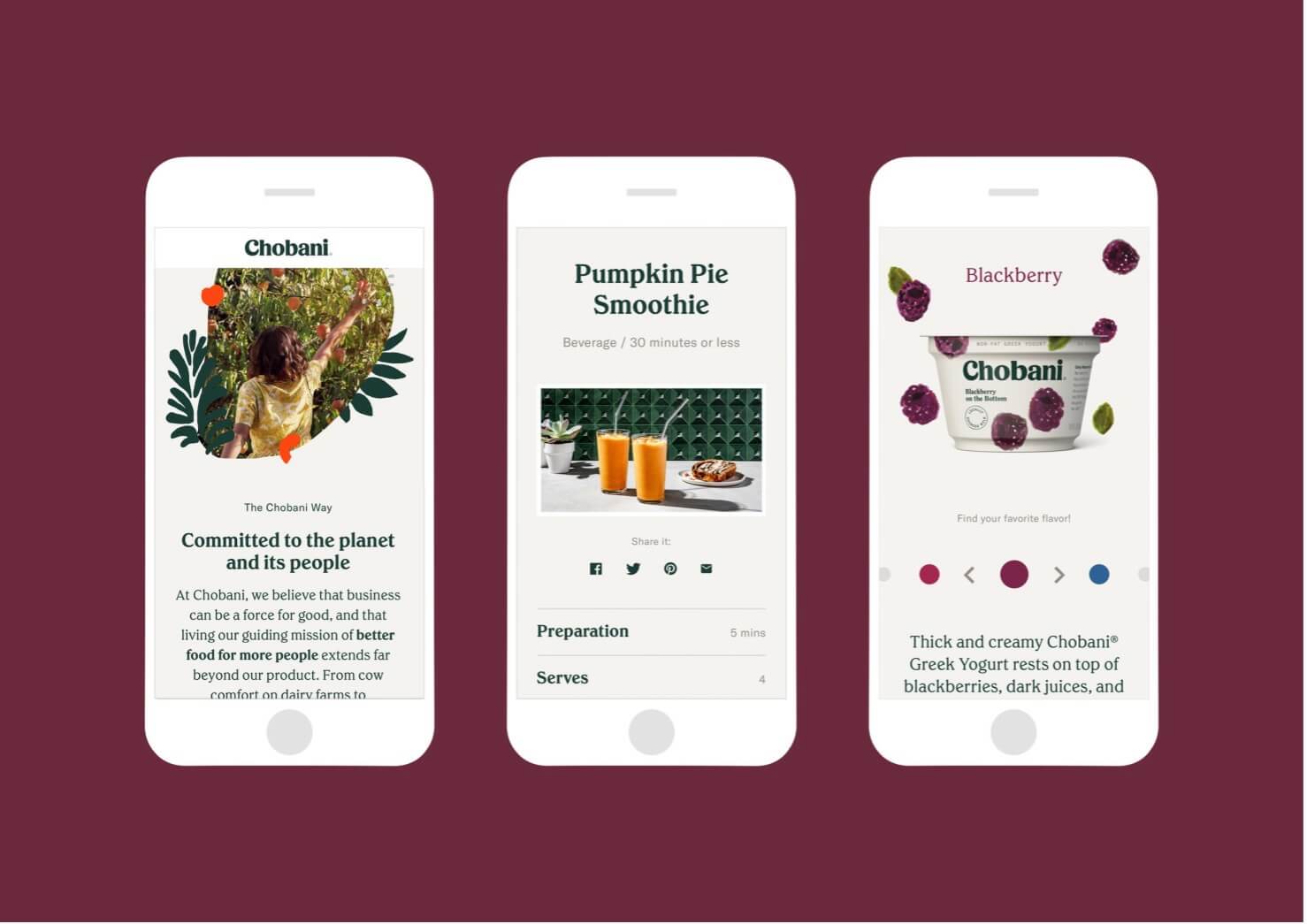
Chobani gives users a convenient and responsive design of their product. It features a lot of white, the content is easy to read, there are no unnecessary elements, which makes it attractive, and nice photos for their products complement the whole design.
Image titles
The trend of using a picture as a headline is becoming more popular. This fashion trend is likely to remain highly sought after in 2025. It is possible to make a headline with a full image with this approach, actively grabbing people's attention. Example: look at how Adidas uses a bold image to draw users in. It helps that the image is Beyoncé.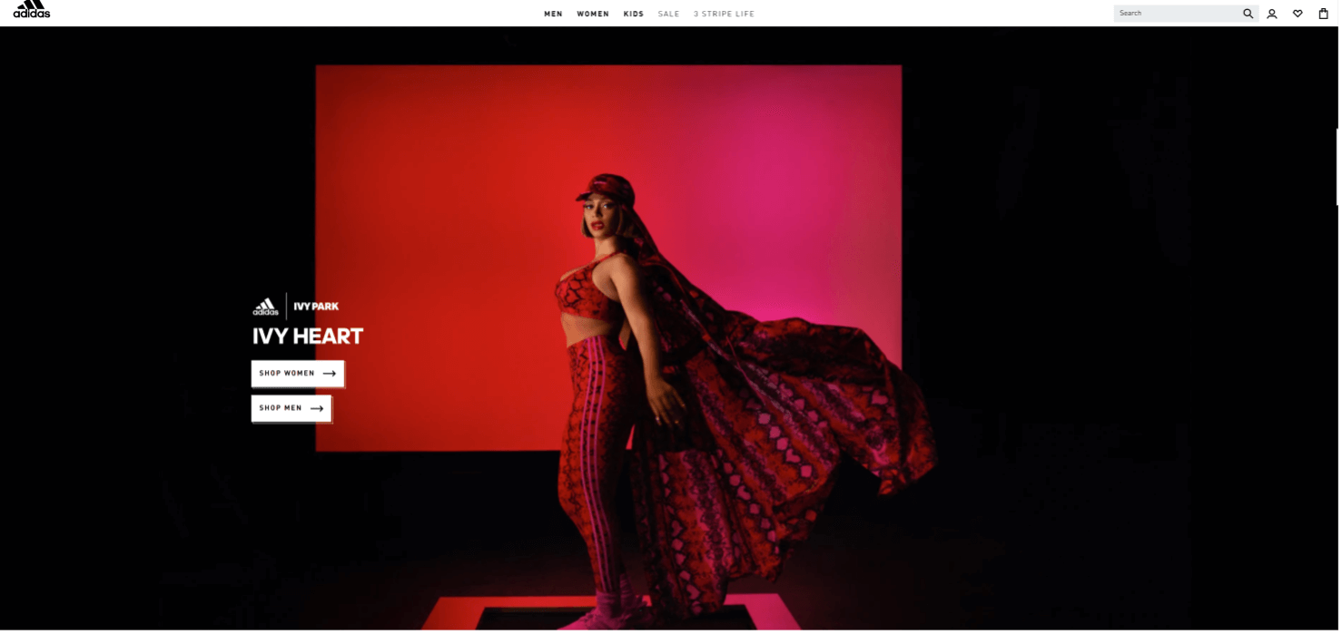
The example above shows a clear contrasting header, a bright, eye-catching image, and a couple of active buttons that send users to the next pages of the site.
Influential on the audience and interesting stories
In the future, websites and other products will be dominated by information in the form of narratives, stories about a brand, a person, etc. It will help to create a sense of communication with the site or company, increase recognizability. Therefore, it is important to tell the right story about the brand, product in the content, advertising campaign. Quality design and compelling story telling will definitely convey values and other information to the target audience.Color trends
Color trends are another trend that changes yearly. A certain color begins to prevail each year and it is increasingly used by designers. So in 2019 blue was popular, then mint, in 2021 gray became popular, and later pastel shades. In 2025, according to various predictions, the color Aqua will prevail. This is a technological shade of blue. Adding to the color trend are gradients, which cover a range of colors. They are excellent for working with a wide audience.The psychology of the color itself is an equally important part. It is important to explore what might be behind a particular shade before working on a project with a company's new palette. Everything should be in line with the brand. For example, cool and soft colors are more suitable for background and information, while bold and warm shades (red, green, etc.) are for a call to action.
Featured image above can be considered as a good example of using muted colors and gradients with illustrated design. Additionally, there is highlighting of the button with a bright green color, which will attract any user for sure.
Advanced AI and machine learning
AI and machine learning are becoming increasingly important. Although the development of artificial intelligence is accelerating, the tools are becoming more accessible to a wide range of people, including designers. Artificial intelligence will not replace humans, but it can significantly help in performing various tasks.Meanwhile, designers will be able to provide a personalized user experience to each visitor of a website or app to meet the demands and needs in a short time. AI helps to customize content quickly based on user preferences or behavior.
The introduction of AI and machine learning into web design offers the most personalized interaction possible. The developer workflows themselves are more efficient and faster.
Digital accessibility
In this case, we are talking about a design that will be accessible to everyone, regardless of individuals' abilities:- blind;
- deaf;
- people with dyslexia;
- users with cognitive disabilities.
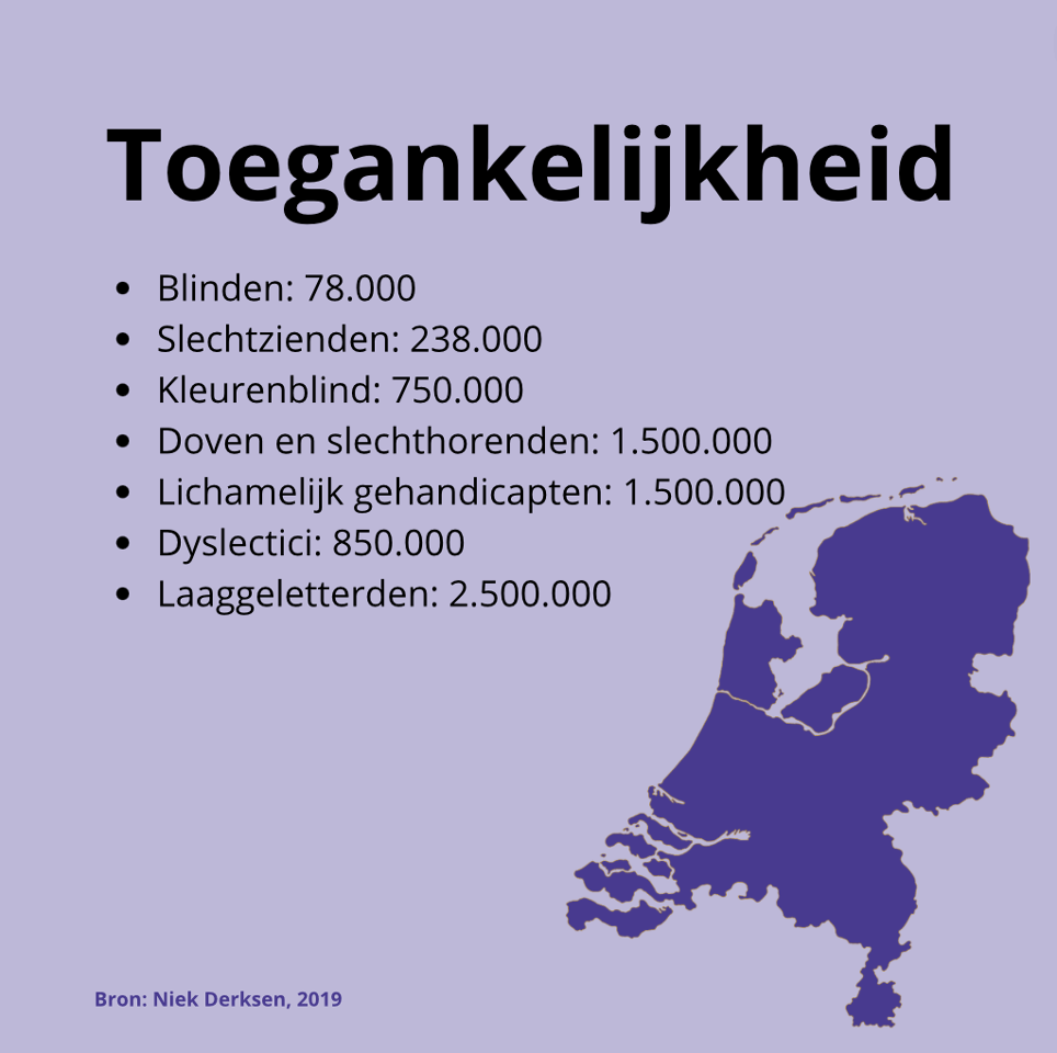
By 2025, all software, websites will have to comply with international rules and principles of accessibility. The goal of this approach is not to exclude people on the Internet.
Along with digital accessibility, we should also mention design functionality. Of course, the choice always comes from the needs of the application or website, psychology. For example, the use of color psychology helps not just to get with a great look, but also high functionality.
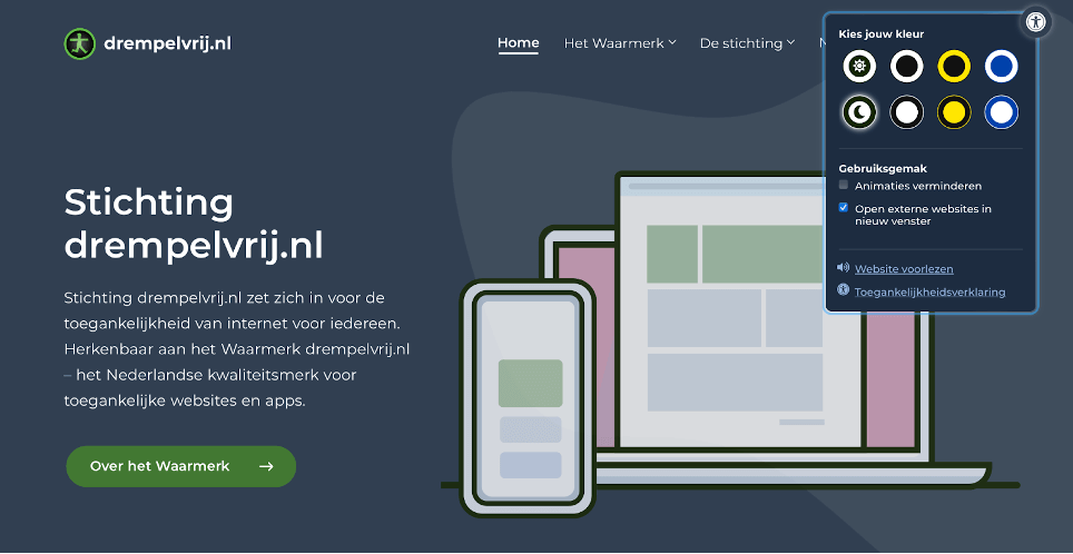
Working in this trend you can use the following design elements:
- Forms that will be comfortable for the bulk of people.
- Text that is easy to read on any device.
- Elements with sufficient color contrast to highlight images, text, buttons, etc.
- Ability to scale text.
- Pictures with descriptions.
A digitally accessible website is a current trend that will become highly popular in 1-2 years.
Eco-friendly design
News about the environment is making the headlines every year, and in significant volume. Ranging from global warming to pollution, fuel use and clean air, it is an important topic for the entire planet. People have started to take such issues more seriously.As early as 2024, even in the field of web design, there is a lot of focus on eco-friendliness.
Interesting fact: loading a page on the Internet emits 0.58 grams of CO2. But if 10,000 people visit the site every day, the number increases to 2.6 kg of CO2!
Green UX is a modern design solution that will gain more popularity in 2025. In order to improve the environmental situation, it is important to consider the following factors when developing websites and designs:
- Sustainable hosting using green energy. It can be solar, wind, etc.
- Minimalistic design is not just popular and in 2025, but durable. It requires less code, resources, images, which has a positive impact on the environment.
- Green design is about optimizing pages, images and videos. The approach will speed up loading times.
The described trend will be appreciated by customers and the world in general.
Immersive 3D elements
The trend presented will bring the user experience to a new stage of development. Immersive 3D elements in design will give not just new impressions, but also a great contribution to the stories on the site, the transfer of information.Implementing in-store directions, for example, will allow for a better familiarization with the product prior to purchase. For educational projects, 3D elements will simplify the understanding and perception of information with the help of dynamic details. This approach is very useful for the target audience, increases their loyalty to the company or a particular product.
It is possible to simplify the use of immersive elements with the help of Three.js and WebGL. Successful integration of 3D elements is achievable with a careful balance. The abundance of such details distracts users from the main purpose, causes suppression when working with the application or website. It should be used only in situations where the design requires it.
«Bento Grid»
A full-fledged concept by the designer, which can be seen more and more often today. The main focus of such a trend is an attractive and effective website layout. Pictures, text, buttons and other page elements should be presented in a structured way.
While using this direction you need to keep in mind the proportions and balance. Each of the elements has its own place and space, which guarantees convenient and clear display of data. In addition, it is pleasant for the user to work with such interfaces.
Bento Grid is suitable for websites and applications in any field, in different directions. From e-commerce, portfolios to event-specific software or informational sites. Not only is the trend modern, but it is universal and suitable for implementation in projects for the year 2025.