
For people, the choice of colors in clothing reflects their mood and personality. Similarly, color trends on websites often reflect our collective reaction to an ever-changing world. In 2025, this trend will continue. Some companies will opt for saturated colors that uplift site visitors. Other brands will seek harmony in soothing neutral tones to evoke a sense of nostalgia and safety for users.
Keeping up with the latest trends and public sentiment is very important. This is how companies emphasize that they are on the same page with their audience and help to deliver the right message to consumers. Today we predict what colors will help brands stand out in 2025.
What is a website color scheme and why is it important?
Color schemes represent an important way to use color in web design. Such patterns can be used to better organize and sequence the elements of a website. They help to highlight the most important elements, to emphasize certain places. And the user - it is easier to navigate the site and find the necessary information faster.3 ways of creating a color scheme
Monochrome is one of the easiest techniques for creating a color scheme. The designer chooses one color and combines it with shades from the same palette.
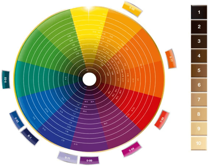
A second slightly more complex approach is the complementation scheme. The designer chooses one color from the color wheel and combines it with another that is on the opposite side of the palette. Such combinations are interesting, but when using them, you need to keep a balance. Ideally, one color should be dominant.
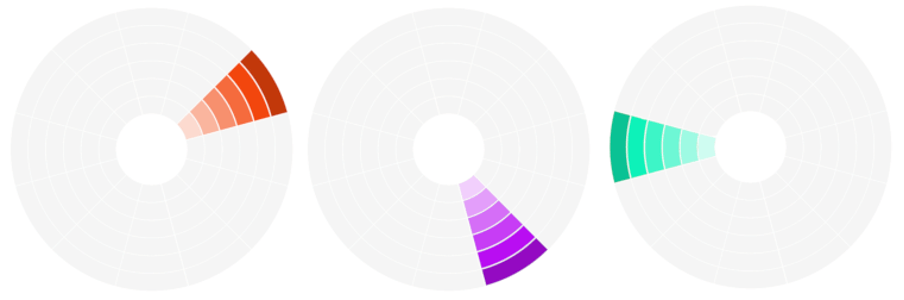
The last scheme is triad. As it is clear from the name, here 3 colors are combined, but they are not chosen randomly. Colors in the triad are chosen so that they are located next to each other at an interval of about 120 degrees. Adhering to this rule, you will get a beautiful color combination.
Color schemes for websites - trends 2025
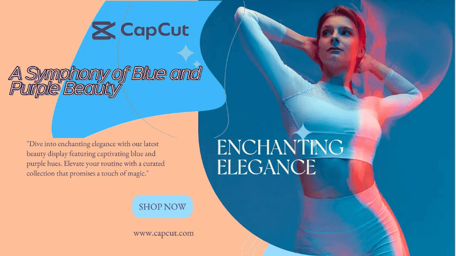
The future is coming today. This phrase has become a cliché, but there is no denying that it is very correct. It refers the ability to correctly anticipate and follow trends in marketing. Including in the creation of websites. Colors play a key role here. This is what we will focus on in the new review. What shades and color combinations can set the trend in web design in 2025?Trend 1. Neon colors
Noxious colors have become a trend in 2024. Although some people consider them “tasteless”, the neon fashion has caught on. And is likely to remain in the trend of color schemes for websites.
It's a big plus that neon colors help to express boldness, creativity, and novelty. We recommend keeping this in mind if you want your brand to be associated with a rebellious image, or if you are targeting a predominantly young audience that is “brewing” in the same energy.
Neon colors can and should be combined with each other. Either combined with basic black, white or gray. It is essential not to overload the visitors.
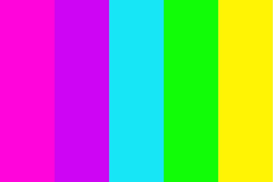
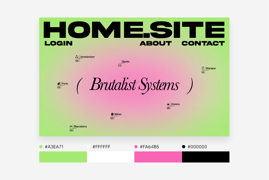
This example uses a combination of neon green (#A3EA71) and pink (#FA64B5).
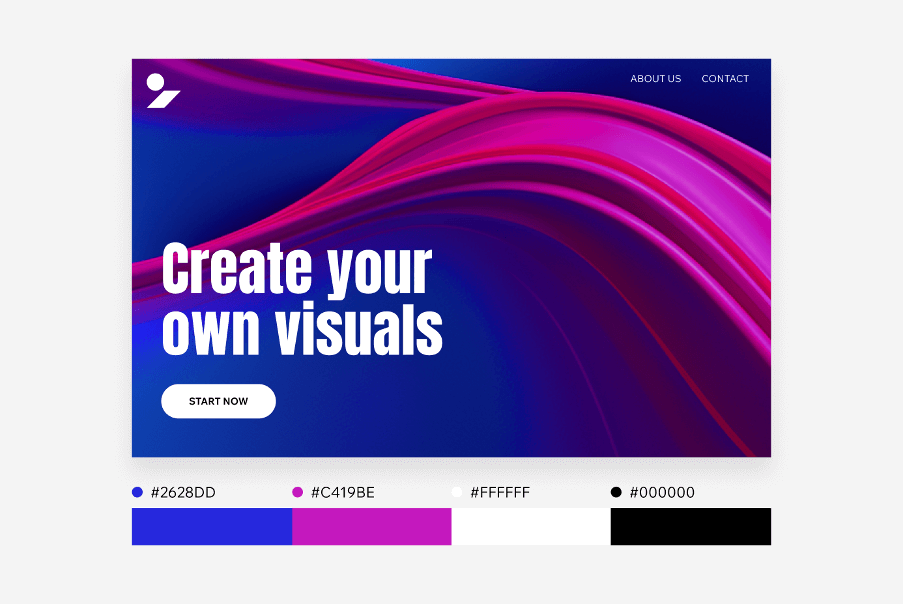
And here's how the bright pink color is complementing the deep shade of cobalt blue (#2628DD).
Trend 2. Colors with “dopamine”
After the difficult events that have shaken our world in recent years, the trend of “dopamine” colors seeks to create feelings of happiness in the consumer. And we have no doubt that if this world lacks anything, it is positive emotions.
Vibrant colors, help fighting against fatigue. These colors awaken our senses and definitely draw attention to the site.
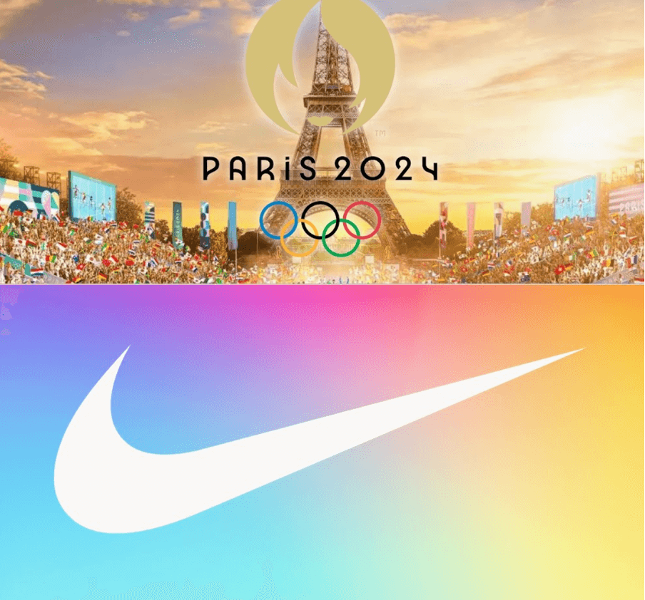
Major brands like Nike have already started experimenting with bright hues in 2024. While these “dopamine” colors aren't as edgy as neon, they're also eye-catching.
Trend 4. Burgundy
The color burgundy creates a sense of drama and nostalgia. It makes us think of a bottle of red wine, cherry lipstick on the lips of retro actresses and autumn leaves. Psychologists have found that the color burgundy whets the appetite. Such a deep and soothing shade will be the perfect choice for a restaurant or wine bar website.Combinations
An interesting idea is to incorporate elements of olive green (#5D5C31) as shown in the picture. Also, bordeaux goes well with mustard yellow, or with base colors.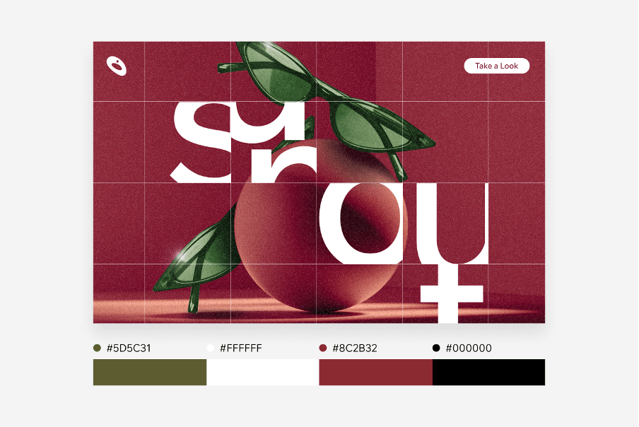
Trend 5. Sandy
In contrast to the bold color trends described above, sandy and earthy colors look more natural. They can be used to replace boring neutral white or gray.Combinations
The sandy shade (#E5BB89) can be paired with deeper shades of brown or even burgundy.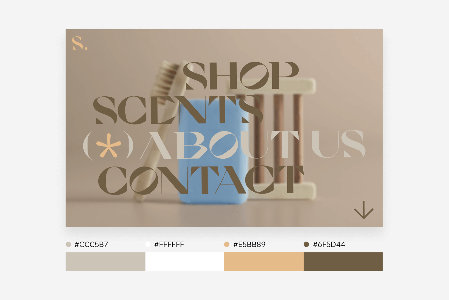
Trend 6. White
White has become the predominant color on many websites in recent years. This is part of the global trend towards minimalism. The basic message of which “less is more” has proven to be very effective.
Thus, we can guarantee that the trend of white websites will continue this year as well. Don't overlook it if you love simple graphic design and make a connoisseur of good taste.
Black and white combinations
The classic website color scheme of black (#F4F4F4F4) and white (#000000) will always be relevant. In 2025, it will continue the trend towards minimalism and also in the area of logo trends.
While black and white is nothing new, talented web designers will find a field for exploration and experimentation here.
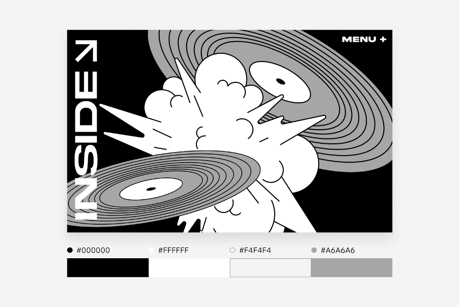
For example, large typography is visually more appealing when they are expressed in these monochromatic tones. The black and white style can serve as an anchor for new experimental trends. You can play with spectacular shapes, unusual fonts and bold typography without falling into excess.
Trend 7. Metallic gray
Given the upcoming space race, it's no surprise that one of the trends for 2025 is metallic gray. It can range from muted gray to bright aluminum to starry shine.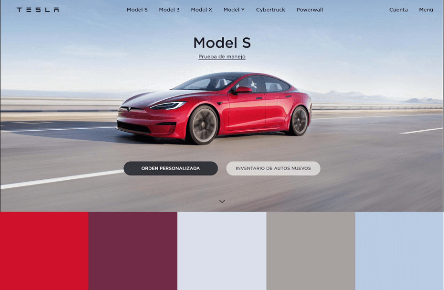
Metallic shine takes boring gray to new horizons. If flat gray backgrounds used to be considered taboo or looked like an unfinished layout, now they are gaining popularity.
This lunar tone is successfully coming to life in typography. Fonts with metallic 3D effects are coming into fashion as part of the general trend towards futurism. Perhaps the moon and stars theme will inspire you when designing your website.
Trends 2025 according to WGSN
WGSN is known to everyone who works in marketing, advertising and web design. It specializes in forecasting consumer trends. According to experts, this range of colors will be relevant in 2025.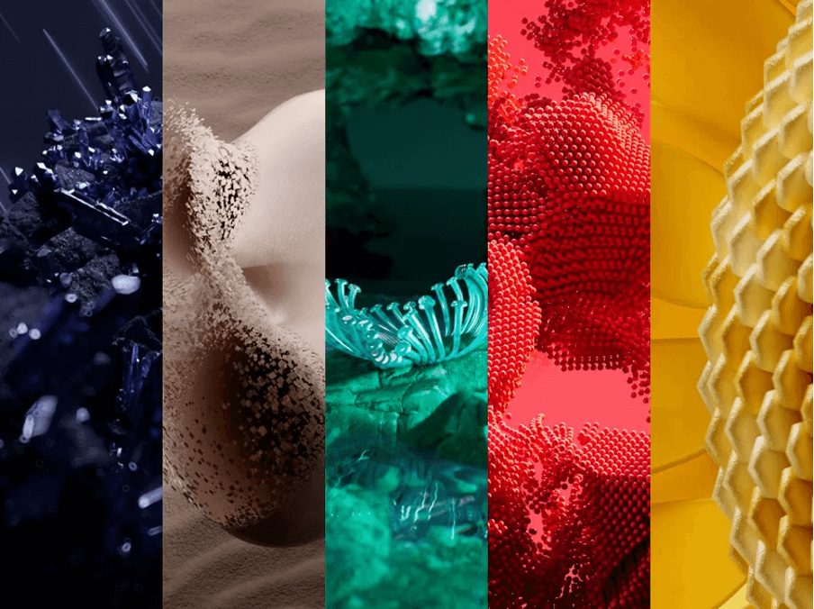
Here, let's explore these color trends in detail.
Ray Flower
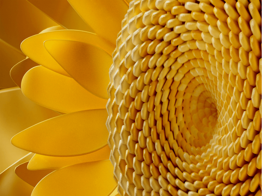
In WGSN palette you will find a very peculiar warm color . It stands out for its restraint and honey tones. The designers draw on various elements related to nature - sunflower, honey, wheat, skin color, etc. It is a natural and organic color that we have no doubt will be frequent in many website designs.
Future Dusk
In the stressful and turbulent world, this color will be an antidote for many consumers. It induces a psychological effect of peace and tranquility.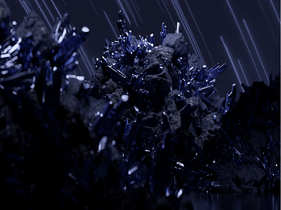
Future Dusk represents something between deep blue and violet. These are the colors of mystics, night, tranquility, space. This shade is suitable for sites with futuristic design. By the way, it combines well with metallic gray, another trend of 2025.
Cherry Lacquer
Cherry Lacquer is a competitor to the deep shade Future Dusk. It confirms the burgundy color trend we mentioned above.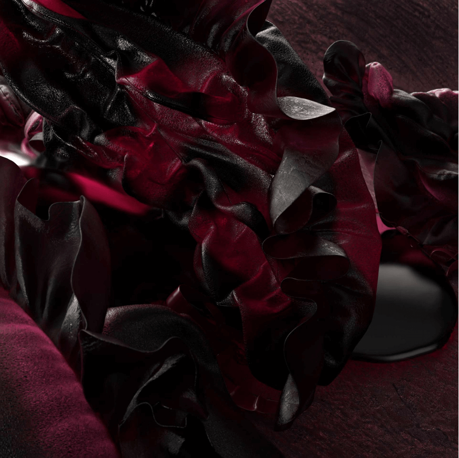
In the opinion of experts, the color Cherry Lacquer symbolizes the trend of escapism and self-assertion, as well as the desire to delve deeper into one's own emotions.
Aquatic Awe
Turquoise continues the global trend of eco-activism and calm colors. It will suit brands that work in the health, beauty, sports industry.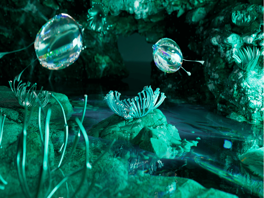
However, in this shade of turquoise you can also read the notes of neon. Therefore, it will perfectly complement the websites of companies that develop digital products.
Refreshing turquoise makes websites look modern and definitely attracts attention. Note how well turquoise is combined with the peach shade in this example.
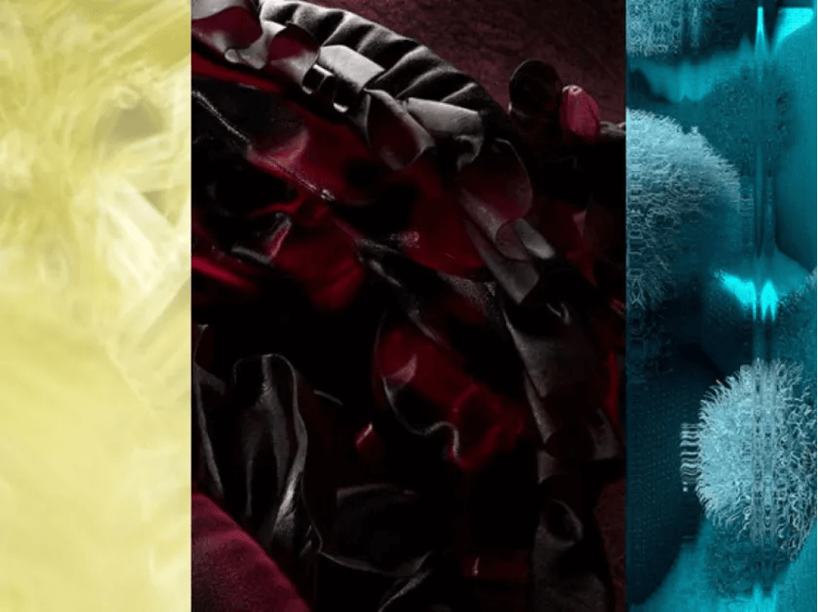
Retro Blue
WGSN suggests staying with retro blue for those who are not willing to take the plunge into bright turquoise.
According to experts, it can cause nostalgia in Generation Z and Kidlets. Therefore, if the audience of your site fits such parameters and you like calm turquoise, we advise you to take a closer look at this shade.
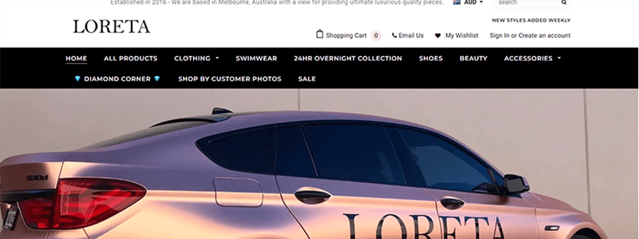
Transcendent Pink
In confirmation of the sandy color trend, WGSN suggests taking a closer look at Transcendent Pink. This color feels more like beige than pink. It continues the trend for restraint and neutrality.
Transcendent Pink is a universal color that will suit companies working in different niches. It can be equally appreciated by consumers of different countries and ages.
Here's an example of how successful the sandy pink color was for a luxury car brand.
Sunset Coral
It is the most intense and vibrant color in the WGSN trend color palette. It conveys energy, boldness and intensity. An elegant and cheerful tone that we can easily associate with vitality, optimism, passion, desire and great ambition.
In the overall 2025 range, where calm and balance prevail, the rich scarlet color will definitely be the cherry on the cake. It will fit perfectly with the “dopamine” designs we wrote about at the beginning of the review.
How to choose a color scheme for a website?
A few simple rules should be followed here, which will ensure harmony in the use of colors and successful UI design.Know your audience
Remember that each color has a specific psychological impact on a particular audience.
In fact, according to the research, a lot of women and men associate the color blue with reliability and stability. It is the perfect color to build trust in your brand. Companies like Microsoft and Facebook use it. Yellow, on the other hand, doesn't inspire trust in adult users, but is often liked by children.
Keep your color palette simple
Colors are a key aspect of any website. They help the user distinguish the most important elements from the less important ones. Therefore, when determining the color scheme, you should focus more on simplicity rather than using a complex, “moving” combination of colors.
It's definitely worth using strong color accents on buttons and other key elements for users. This will allow them to respond faster in places of interest (e.g. call to action button).
Play on the contrast
Contrast is one of the most important aspects of a good interface. You use it to highlight the most important and functional elements of the layout. If you don't take this into consideration, you may prevent your website from properly guiding the user and they may leave the site. Also, don't forget about people who have vision problems. Large contrasts will be especially helpful for them.
Tip. There's a sure way to check if the contrast on your page is correct - use screen blur. If you look at your website after using this effect and you can still distinguish where the key elements and buttons are, then you have chosen the right contrast.
Golden Ratio 6:3:1
Balance in all areas is the key to success. In website design, the situation is no different. 60%, 30% and 10% is the best proportion in the use of colors. This means one dominant color (60%) and one complementary color (30%). The third contrasting color should occupy about 10% of the space and highlight only the most important elements.
Conclusion
Creating a website is like choosing clothes that reflect your mood and message. Color trends in 2025 offer us a wide range of options, from bright and bold to nostalgic and soothing. For this reason, designers will have a large field of experimentation to express the uniqueness of their brand.